This semester, students, faculty, and staff have contributed to weekly chalkboard discussions that have taken a variety of forms.
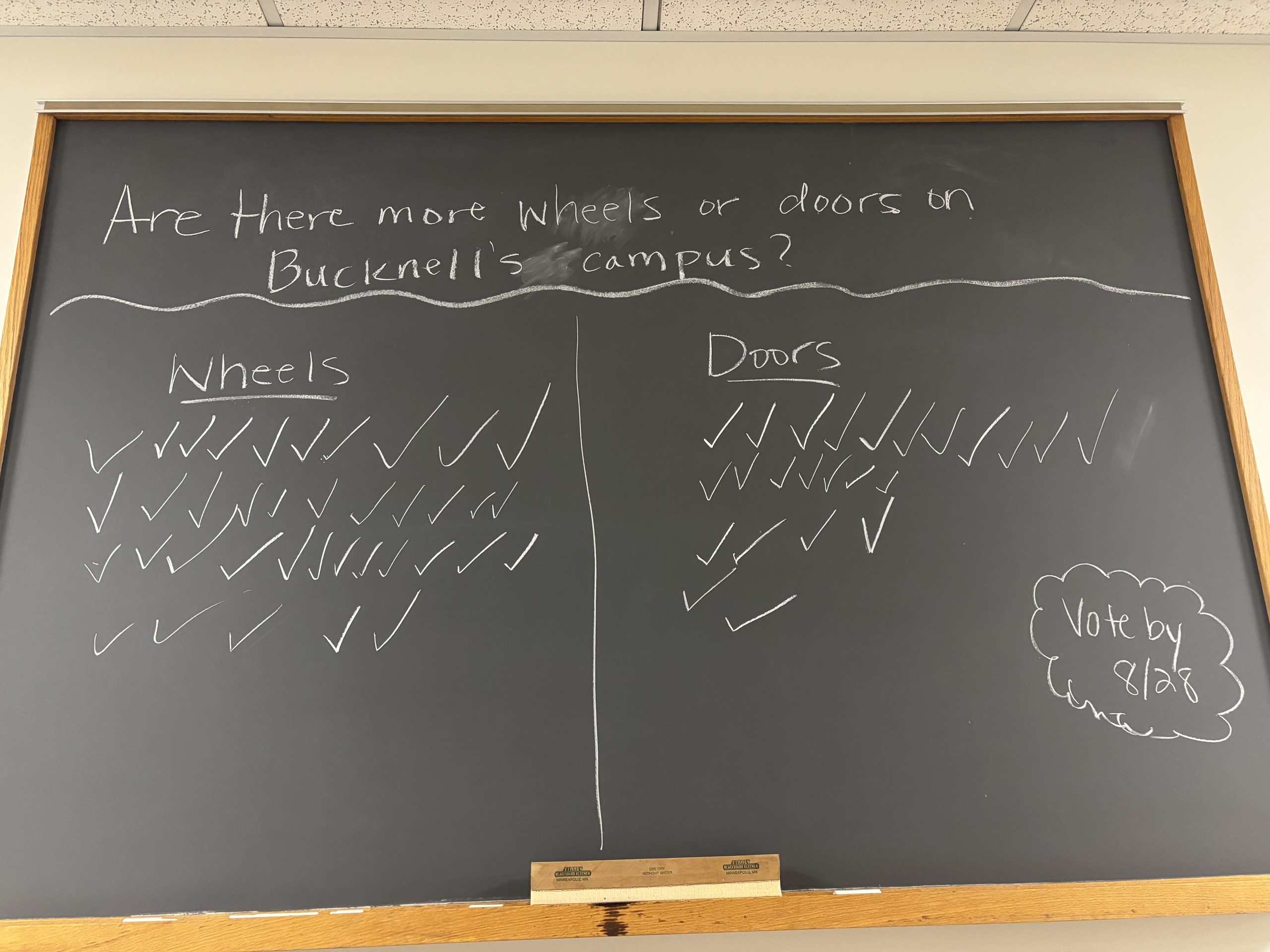
We started off with a controversial one. Are there more wheels or doors on Bucknell’s campus? What counts as a door? A wheel? That’s all part of the fun!
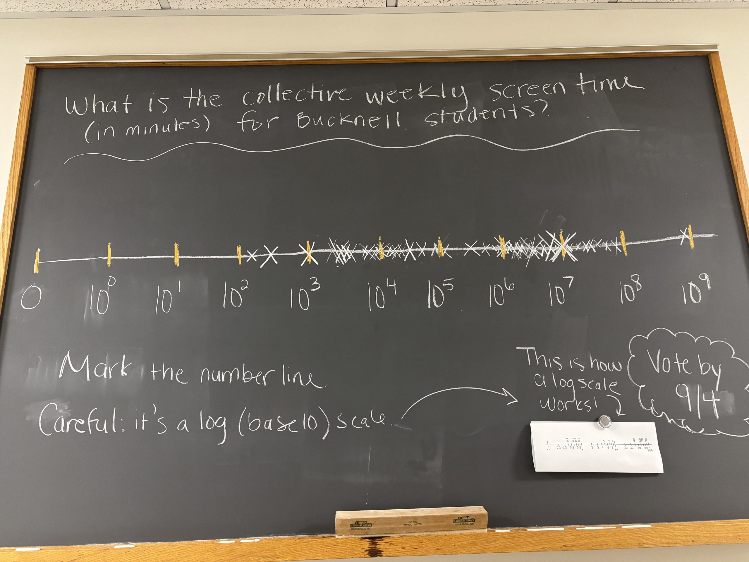
Then we practiced our log scales by guess-timating the collective weekly screen time for Bucknell students.
Follow bucknell.math.stat on Instagram!
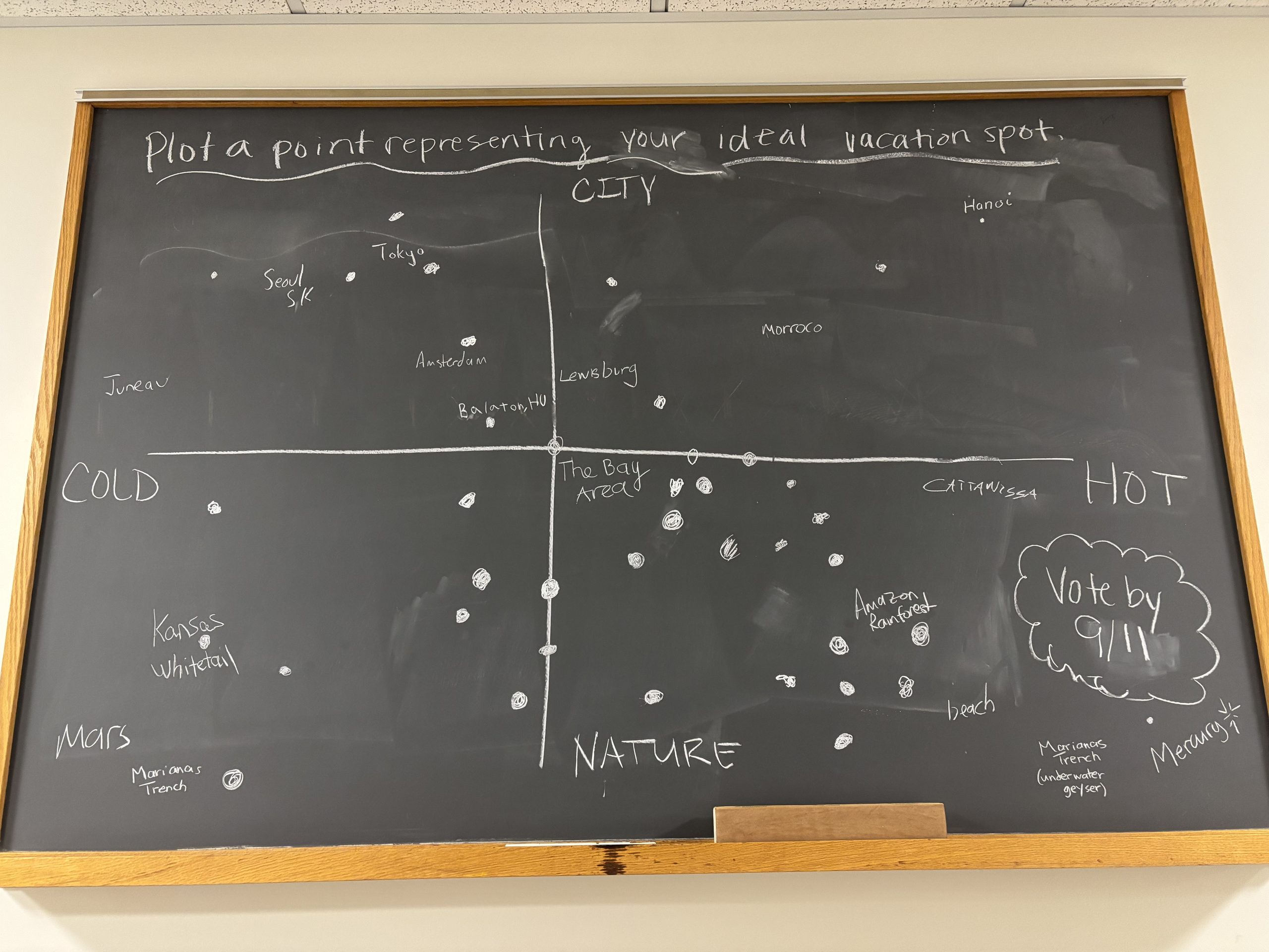
By week 3 we were all already thinking about Fall Break and dreaming about our perfect vacation spots. The Hot/Nature quadrant is most popular!
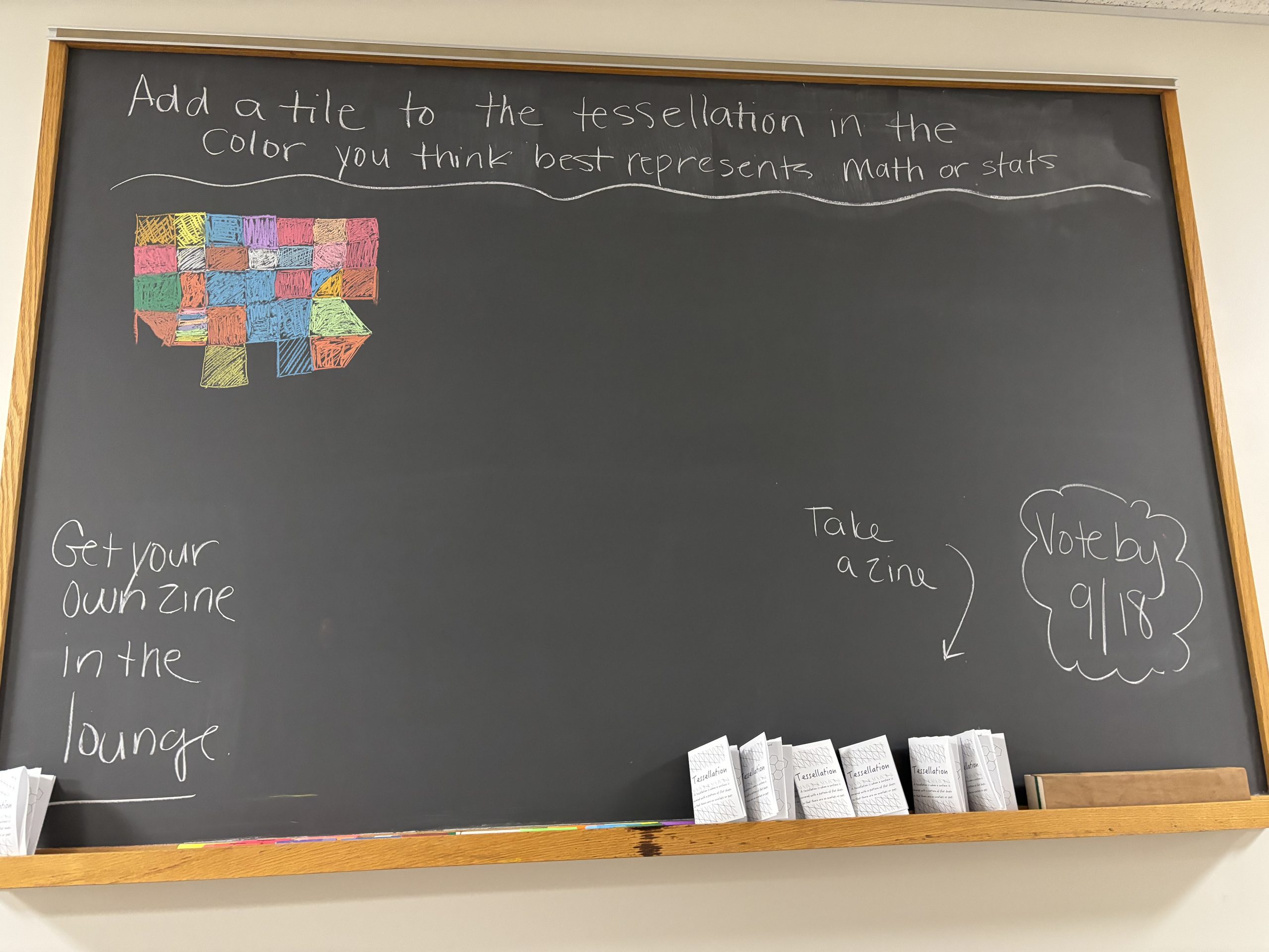
We broke out the special colored chalk to determine what color best represents math or stats while also creating a tessellation. Print and fold your own tessellation zine!
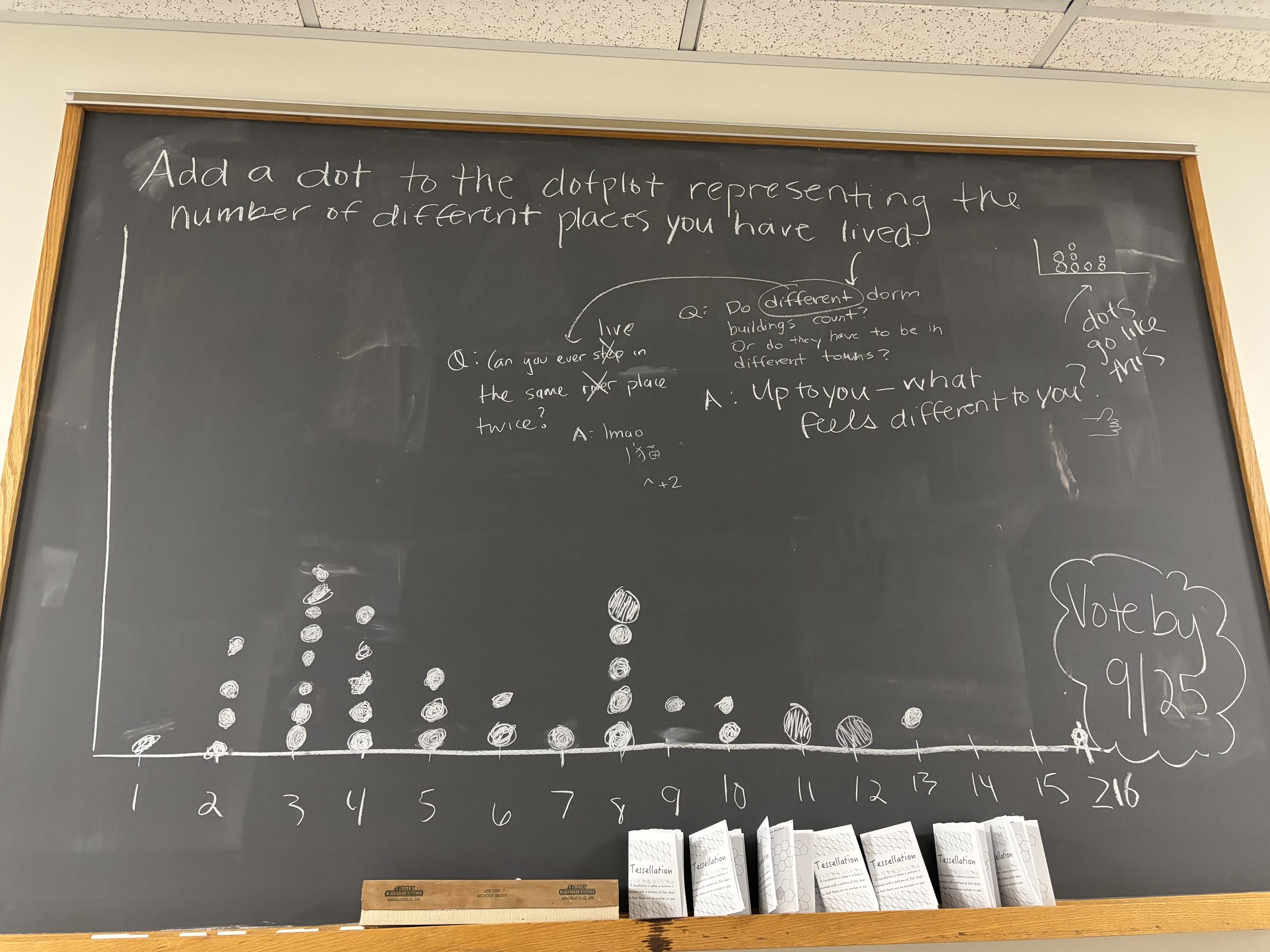
Some good meta-discussion appeared when we were counting the number of different places we have each lived.
Connect to Department of Mathematics and Statistics at Bucknell University on LinkedIn.
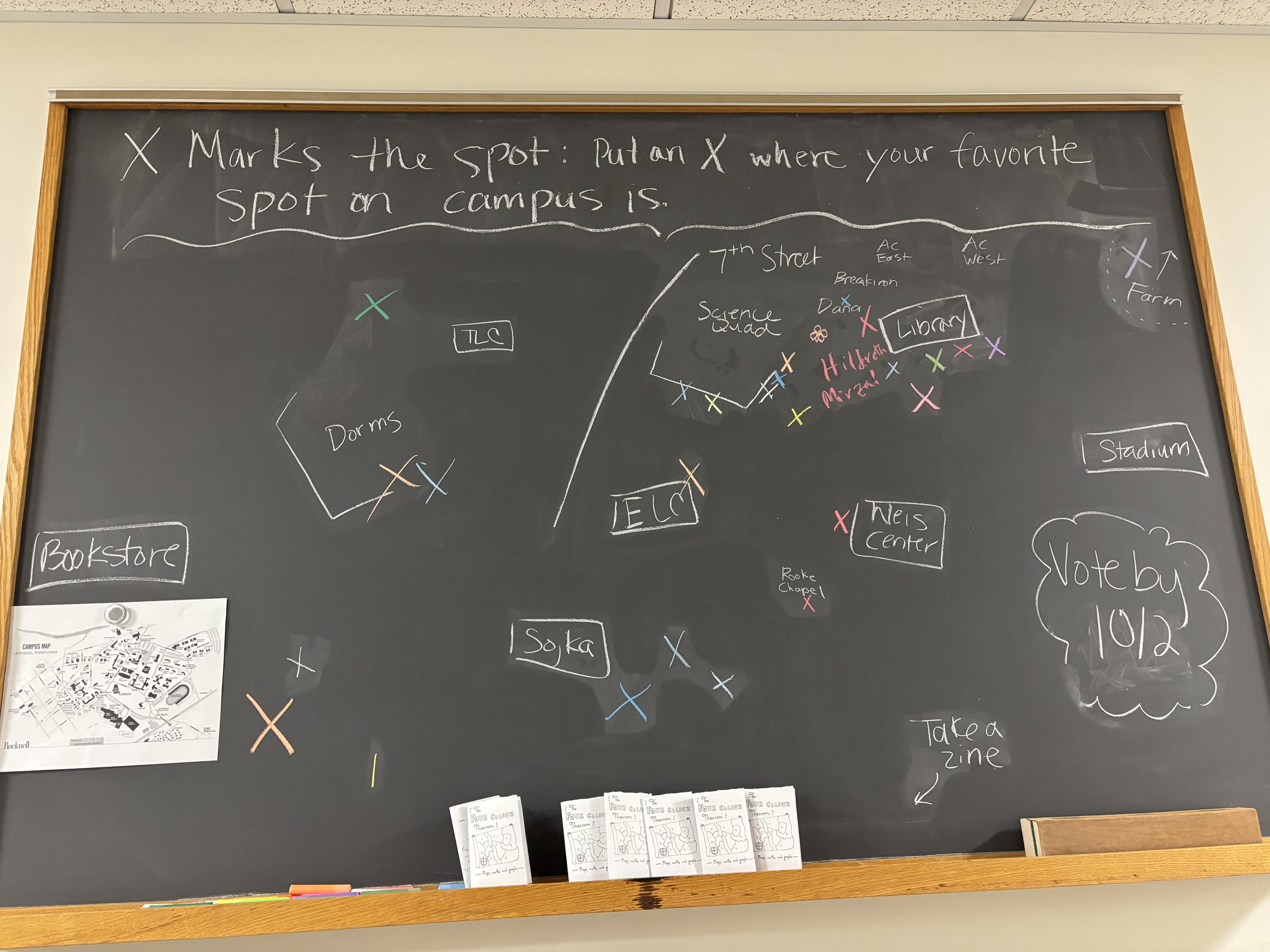
We put our spatial reasoning to the test by trying to map our favorite spots on campus. Again, we felt this one deserved the special colored chalk. Print and fold your own four color theorem zine.
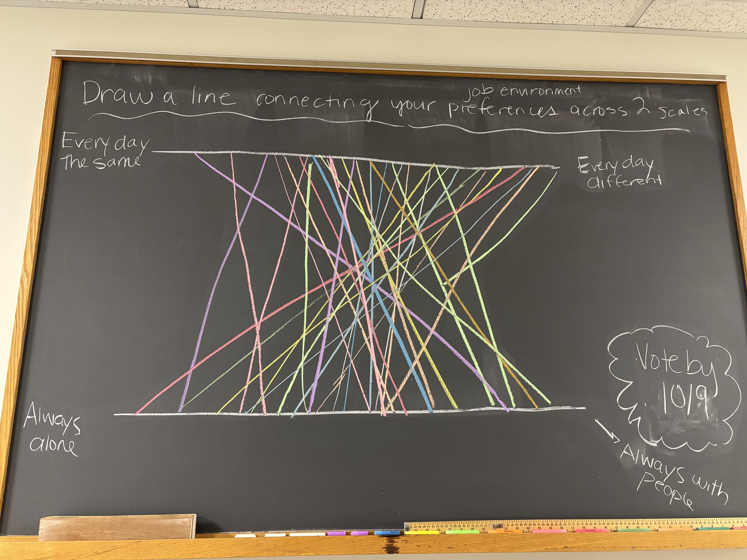
Ahead of Fall Break we considered what makes an ideal job environment in terms of how much variation there is in the day-to-day work and how much time we spend alone v. with other people. We have people with preferences all across the two spectrums. And yes, the colored chalk helps really paint the picture. 😀
Stay tuned for more chalkboard discussions after a much needed Fall Break!
Want a chance to be featured in a future blog post? Respond to our question of the week here, and your answer may be chosen for a future post.